Swae Style Guide
Website & Platform
These are the basic elements that make up our brand identity.
Please read on so you’ll get to know us a little better.
Color palette
Primary Colours
#5bd7ea
#3c79f6
#383f48
#F6783F
#323254
Secondary Colours
#A90B00
#A90B00
#802B52
#6b2244
#AA6BF7
#965edb
#689900
#557c00
#f6783f
#e06e3a
#F07E7E
#6b2244
#e0c508
#c4ae07
#ED4234
#cc3a2c
#9bc9f2
#89b2d6
#5BD7EA
#3c79f6
Logo & Ident
Our logo is a very valuable asset and we must treat it nicely. Please don’t abuse our logo or trademarks as they can’t fight back (our lawyers are a different story though!)
In order to preserve the integrity of the logo, it is important that no other logos, type or other graphic elements infringe on its space. The minimum clearspace around the logotype is equivalent to the smallest bar of the Swae icon.


On light backgrounds:
As often as possible, the logo should appear on white.
Main logo colours are #5bd7ea and #383F48

On dark backgrounds
An option for logo use on black or darker backgrounds.
Icon
Use sparingly
Visual Assets and Interactions
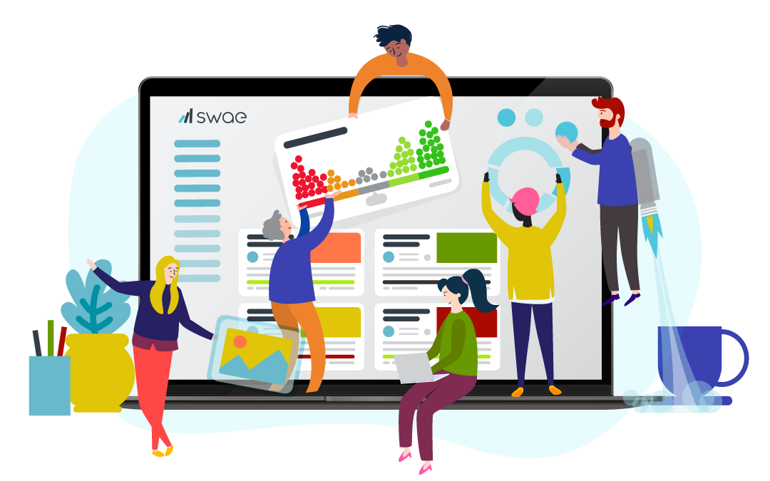
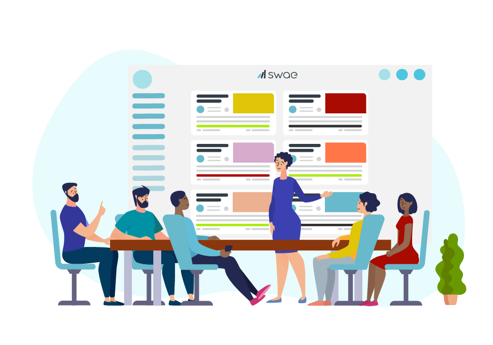
Colour usage in illustrations (from palette above); bright and playful to show Swae’s character. Images should show action and intent, and where possible include motion / video.


Tone of Voice
Swae’s tone of voice:
- Provocative But Factual Using Compelling Arguments
- Bold
- Authentic
- Transparent
- Logical Yet Imaginative
- Witty
- Disruptor at the service of MASSIVE CHANGE for the GOOD
Our tone of voice is not:
- Safe
- Arrogant
- Hyped
- Filled-with-jargon
- Sarcastic or sarcastic humor
Heading 1
Heading 1
Heading 2
Heading 2
Heading 3
Heading 3
Heading 4
Heading 4
Heading 5
Heading 5
Heading 6
Heading 6
Lorem ipsum dolor sit amet, consectetur adipiscing elit, sed do eiusmod tempor incididunt ut labore et dolore magna aliqua. Ut enim ad minim veniam, quis nostrud exercitation ullamco laboris nisi ut aliquip ex ea commodo consequat.
Forms
Input with hover effect
Title of input
Input with hover effect
Input with hover effect
Input with hover effect
Cards

Dashboard
Manage proposals and stats

Collaborate
Find new proposals and collaborate

Vote
Help find our next big success

New Proposal
Start a new proposal